Hishikawa Moronobu, Young Man with Two Courtesans, 1682. The earliest ukiyo-e prints presented scenes from daily life in a simple narrative manner.

Artist unknown, woodblock print from a book about roses, after 1868. Pattern and naturalistic depiction coexist in a print illustrating a mountain rose that blooms in May, attracting a species of water bird.

Kitagawa Utamaro, portrait of a courtesan, late 1700s. Restrained color palette and exquisitely simple composition characterized Utamaro’s prints of tall, graceful women.

Attributed to Katsushika Hokusai, c. 1820. Scenes of everyday life, such as these women working thread, were published in pictorial books of Hokusai’s art.

Katsushika Hokusai, South Wind, Clear Dawn, c. 1830–32. This woodcut of Mount Fuji struck by early morning light is also called Red Fuji.

Ando Hiroshige, Evening Snow at Kanbara, 1832–34. The soft quietude of a wintry evening is captured in a poetic range of grays.

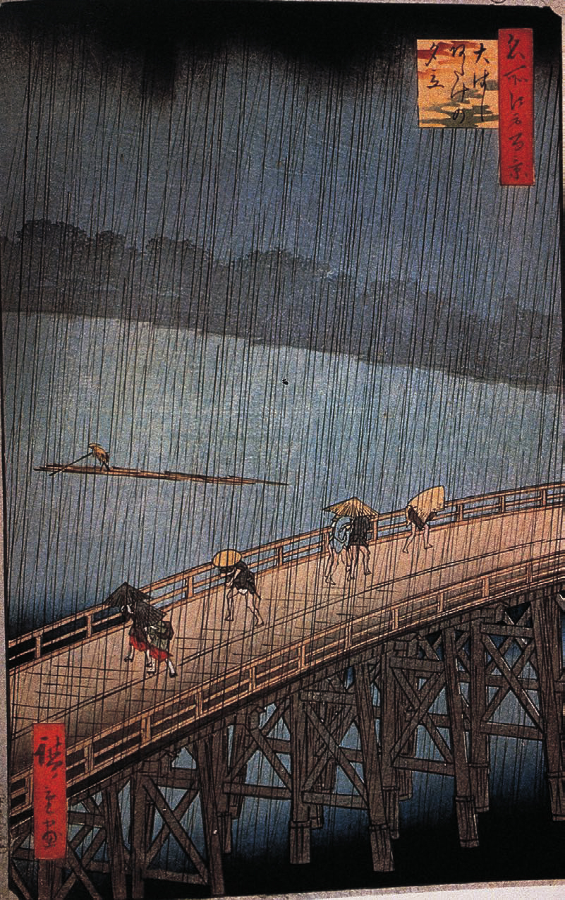
Ando Hiroshige, Evening Squall at Great Bridge near Atake, c. 1856– 59. A moment in time is preserved as a transient human event.

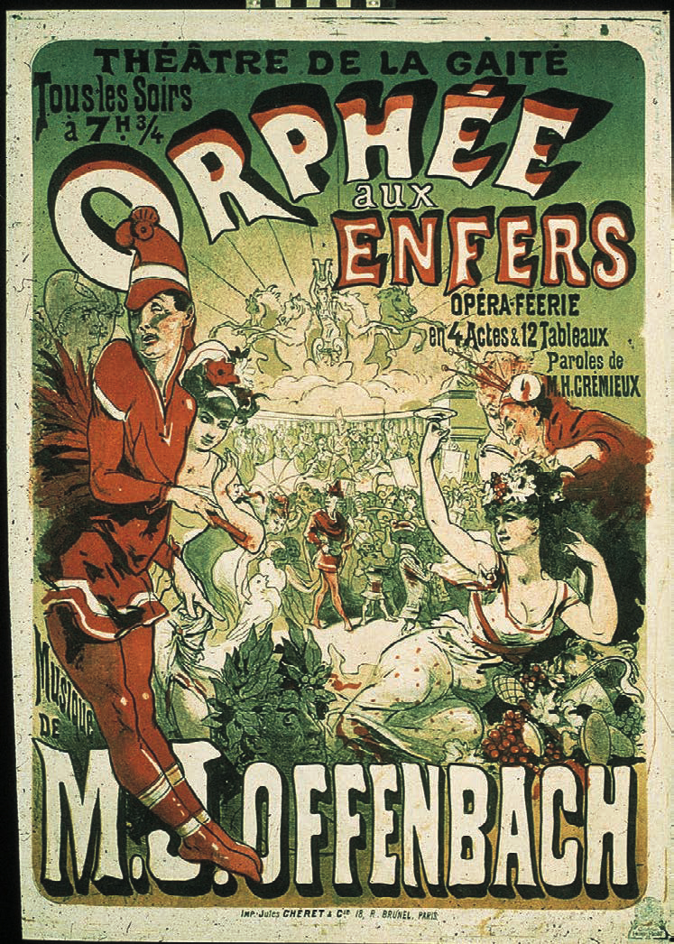
Jules Chéret, poster for Orphée aux Enfers (Orpheus in Hades), 1879. Chéret evolved toward larger, more animated figures and greater unity of word and image.

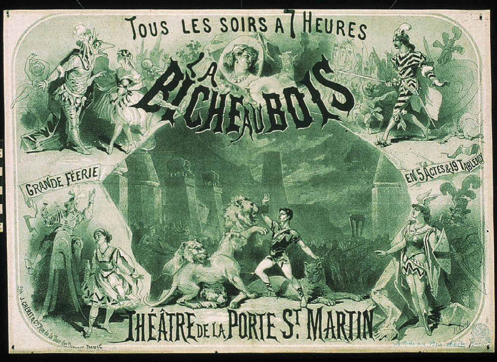
Jules Chéret, poster for La biche au bois (The Doe in the Wood), 1866. Chéret’s early green and black poster used the multiple image format so popular in the 1860s. The lettering is a harbinger of the swirling forms marking his mature style.

Jules Chéret, poster, “L’aureole du midi, Pétrole de Sureté,“ 1893.

Jules Chéret, “Palais de Glace, Champs-Èlysée” (Ice Palace, Champs-Èlysée), 1893. Parisian elegance, a carefree grace, and astounding technical mastery are present. The figures create a lively play of angles, linking the top and bottom lettering. As with many of Chéret’s larger posters, it was necessary to print “Palais de Glace” in two sections.

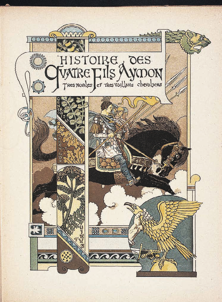
Eugène Grasset, title page for Histoire des quatre fils Aymon (Tale of the Four Sons of Aymon), 1883. Dividing the space into zones, Grasset unified lettering, illustration, and decorative patterns into a total page design. Reynaud, Alard, Guichard, and Richard were four stalwart sons of the Count Aymon of Dordogne in the days of Emperor Charlemagne.

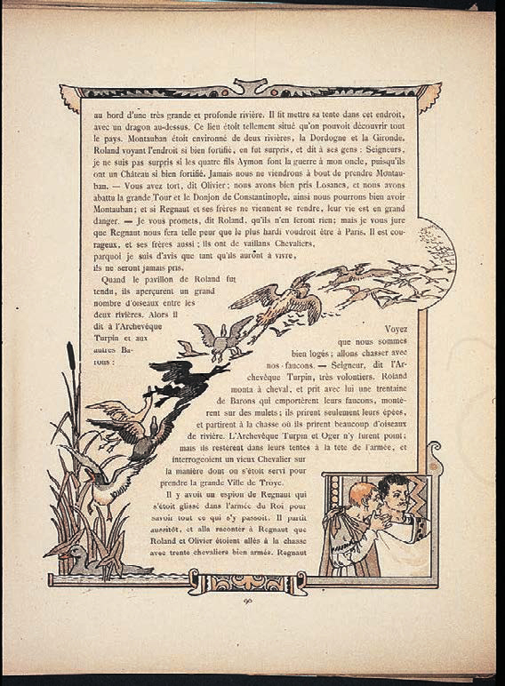
Eugène Grasset, chapter title page and text page from Histoire des quatre fils Aymon, 1883. Grasset achieved a structural unity of type, image, and ornament.

Eugène Grasset, chapter title page and text page from Histoire des quatre fils Aymon, 1883. Grasset achieved a structural unity of type, image, and ornament.

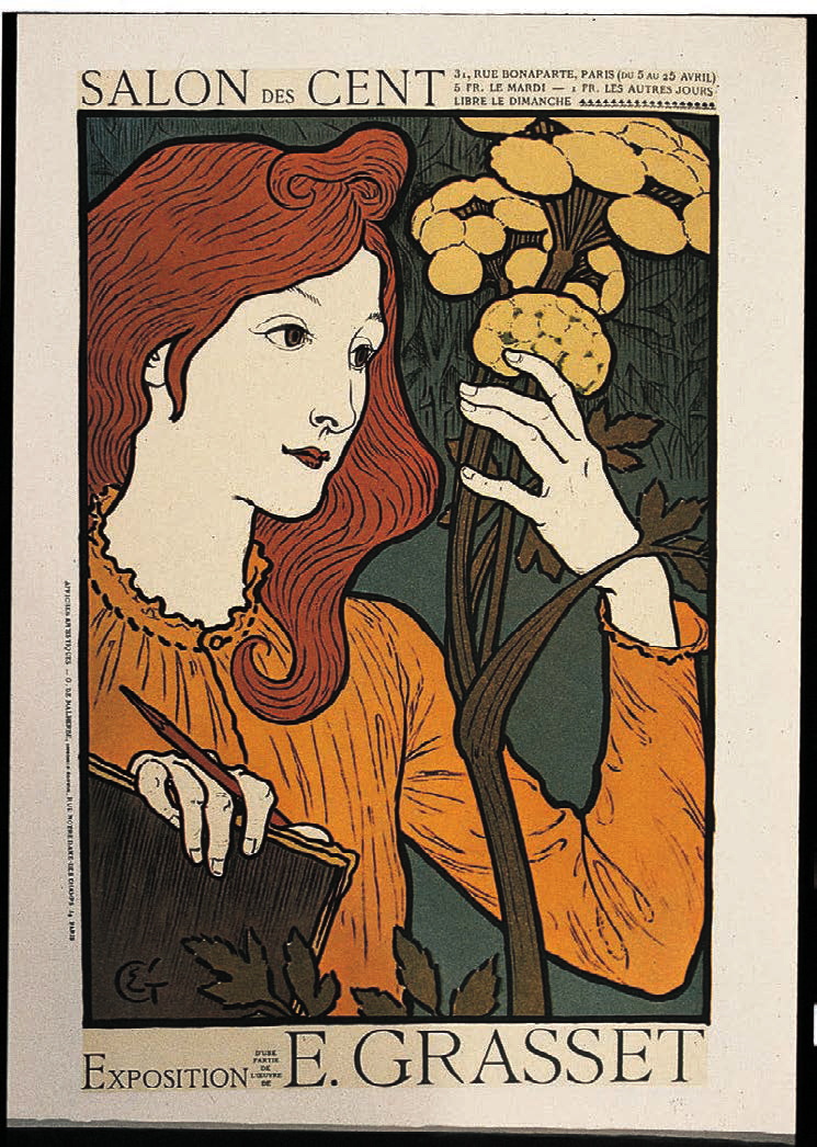
Eugène Grasset, exhibition poster, c. 1894. Quietly demure instead of exuberant, Grasset’s figures project a resonance very different from that of the Chérette.

Aubrey Beardsley, first cover for The Studio, 1893. Beardsley’s career was launched when editor C. Lewis Hine featured his work on this cover and reproduced eleven of his illustrations in the inaugural issue.

Jan Toorop, The Three Brides, 1893. In this pencil and colored crayon drawing on brown paper, the undulating flow of stylized ribbons of hair symbolizes sound pouring forth from the bells. Toorop’s curvilinear drawing inspired his contemporaries.

Aubrey Beardsley, illustrations on double-page spread for Morte d’Arthur, 1893. These images show Beardsley’s emerging ability to compose contour line, textured areas, and black-and-white shapes into powerful compositions. The contrast between geometric and organic shapes reflects the influence of the Japanese print.

Aubrey Beardsley, binding design for Morte d’Arthur, 1893.

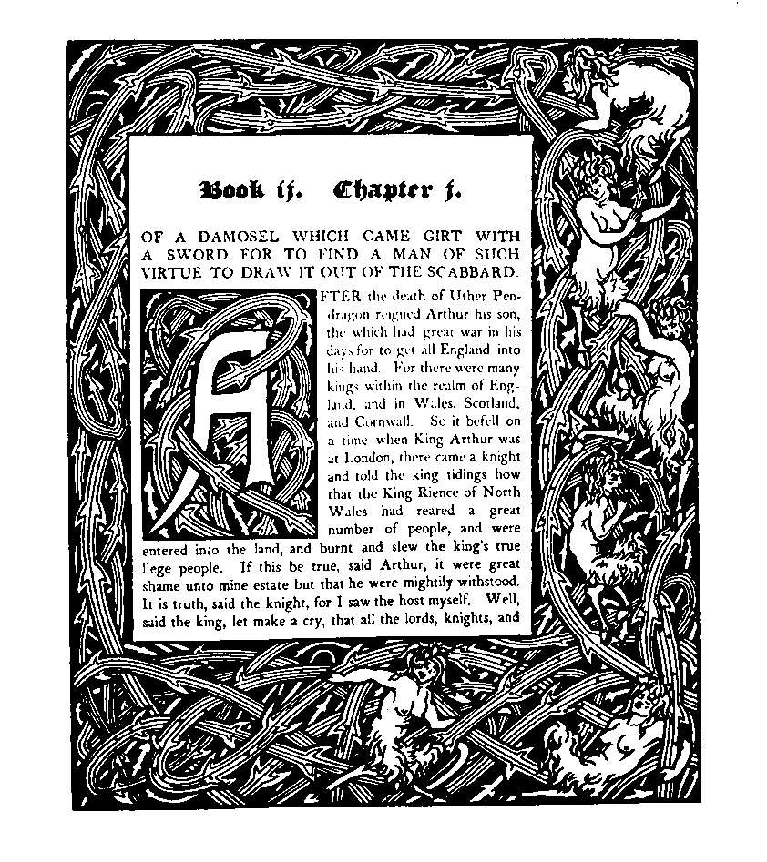
Aubrey Beardsley, chapter opening, Morte d’Arthur, 1893. William Morris’s lyrical bouquets were replaced by rollicking mythological nymphs in a briar border design.

William Morris, page from The Recuyell of the Historyes of Troye, 1892. Comparison of page designs by Morris and Beardsley reveals that their differences reflect a dichotomy of philosophy, lifestyle, and social values.

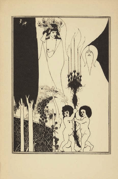
Aubrey Beardsley, “The Eyes of Herod” illustration for Oscar Wilde’s Salomé, 1894. The dynamic interplay between positive and negative shapes has seldom been equaled.

Charles Ricketts, title page for The Sphinx, 1894. Ricketts’s unconventional title page, dominated by an illustration, is placed on the left rather than the right. The text is set in all capitals.

Charles Ricketts, pages from The Sphinx, 1894. The white space and typography printed in rust and olive-green ink are without precedent.

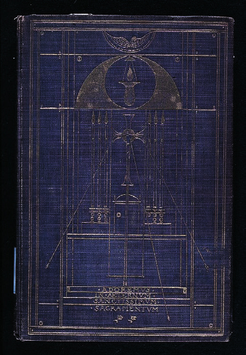
Charles Ricketts, binding design for Poems of Adoration, by Michael Fields, c. 1900. Christian symbolism is abstracted into elemental forms, with rigorous rectangles punctuated by a few well-placed circles and arches.

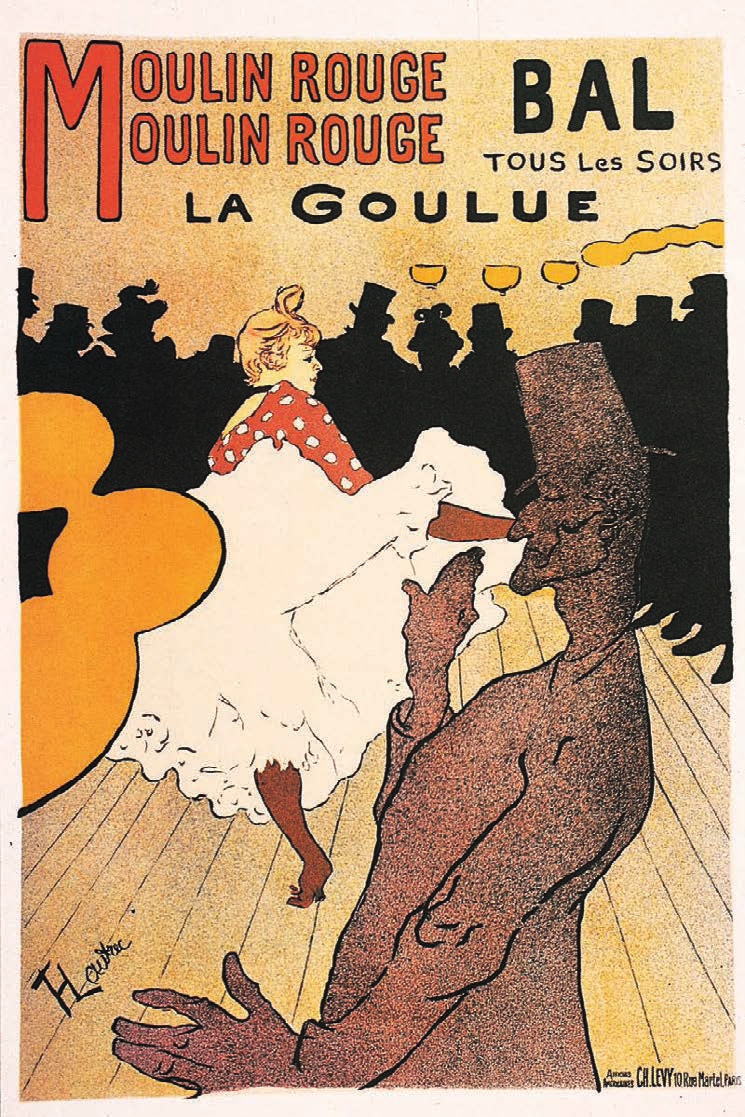
Henri de Toulouse-Lautrec, poster, “La Goulue au Moulin Rouge,” 1891. Shapes become symbols; in combination, these signify a place and an event.

Henri de Toulouse-Lautrec, poster for Reine de joie (Queen of Joy), 1892. The banker Rothschild thought his own likeness had been used for the main character in the book being advertised and attempted to prevent distribution of the poster.

Henri de Toulouse-Lautrec, poster for Aristide Bruant, 1893. The influence of the Japanese print is clearly evident in the flat silhouette, unmodulated color, and stylized curvilinear drawing.

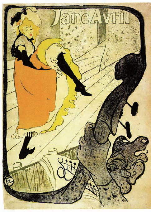
Henri de Toulouse-Lautrec, poster for Jane Avril, 1893. The gestural expressiveness of Toulouse-Lautrec’s drawing on the lithographic stone captures the vitality of the dancer. This poster was created from sketches made during a performance.

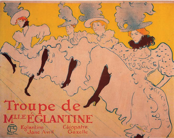
Henri de Toulouse-Lautrec, poster for Troupe de Mademoiselle Eglantine, 1896. The dancers’ stockings guide the viewer from left to right across the poster surface, culminating with the feather collar of the dancer in the foreground.

Théophile-Alexandre Steinlen, poster, “Tournée du Chat Noir de Rodolphe Salis,” 1896.

Théophile-Alexandre Steinlen, poster for Charles Verneau’s printing firm, 1896. A cross section of Parisian society—a mother and baby, a washerwoman, two workers, Steinlen’s daughter Colette with her nanny, a businessman, and sophisticated shoppers—promenades in a nearly life-sized echo of the adjacent sidewalks.

Théophile-Alexandre Steinlen, poster for Guillot Brothers sterilized milk, c. 1897. The red dress functions graphically in a manner similar to Beardsley’s “black spot.”

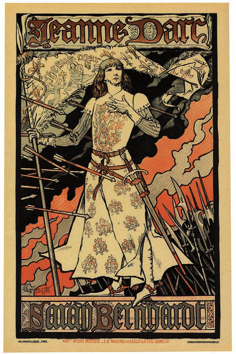
Eugène Grasset, poster for Sarah Bernhardt as Joan of Arc, 1894. A medieval figure stands before sky patterns inspired by ukiyo-e prints.

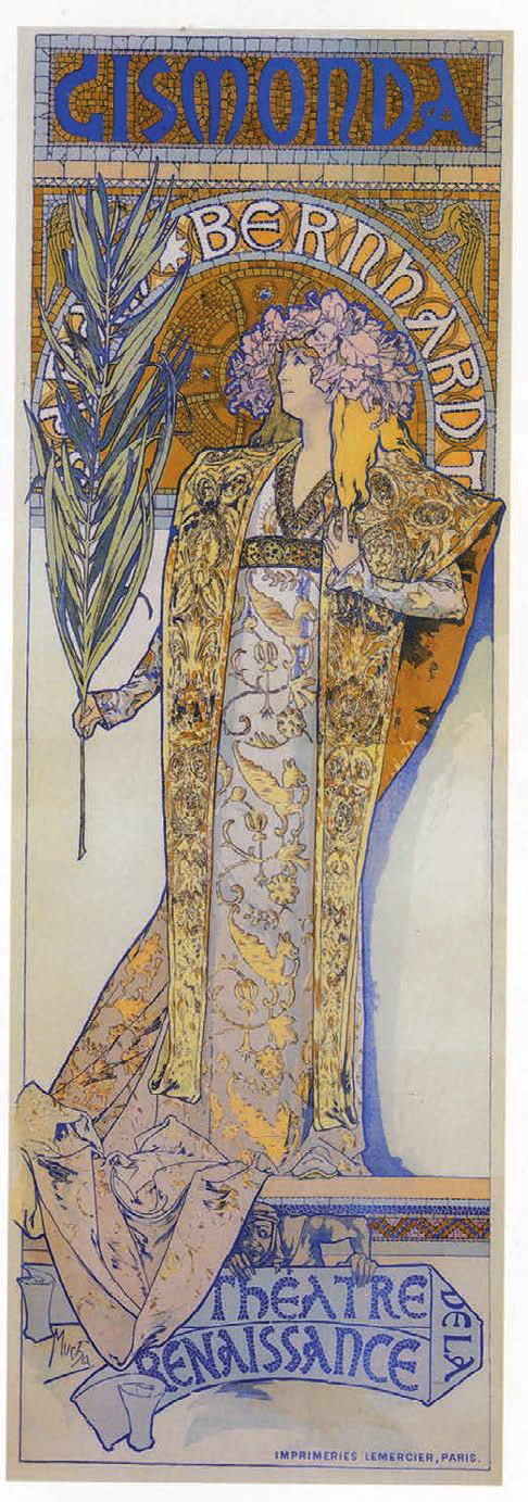
Alphonse Mucha, Gismonda poster, 1894. The life-size figure, mosaic pattern, and elongated shape created an overnight sensation.

Alphonse Mucha, “Monaco Monte Carlo” poster, 1897. The pensive female figure seems mesmerized by the plethora of stylized plant forms surrounding her.

Alphonse Mucha, poster for Job cigarette papers, 1898. Mucha delighted in filling the total space with animated form and ornament.

Alphonse Mucha, poster for the French Commerce Ministry exhibit at the Louisiana Purchase Exposition, Saint Louis, Missouri, 1904. An elegantly clad woman clasps the hand of a clichéd Native American.

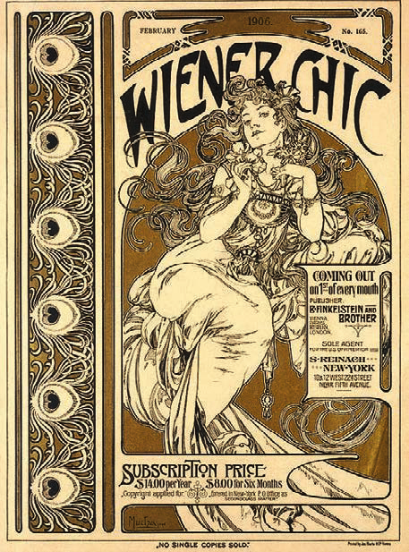
Alphonse Mucha, cover for Wiener Chic (Vienna Chic), 1906. This fashion-magazine cover shows Mucha’s ornamental patterns and interplay between organic areas for typography and illustration.

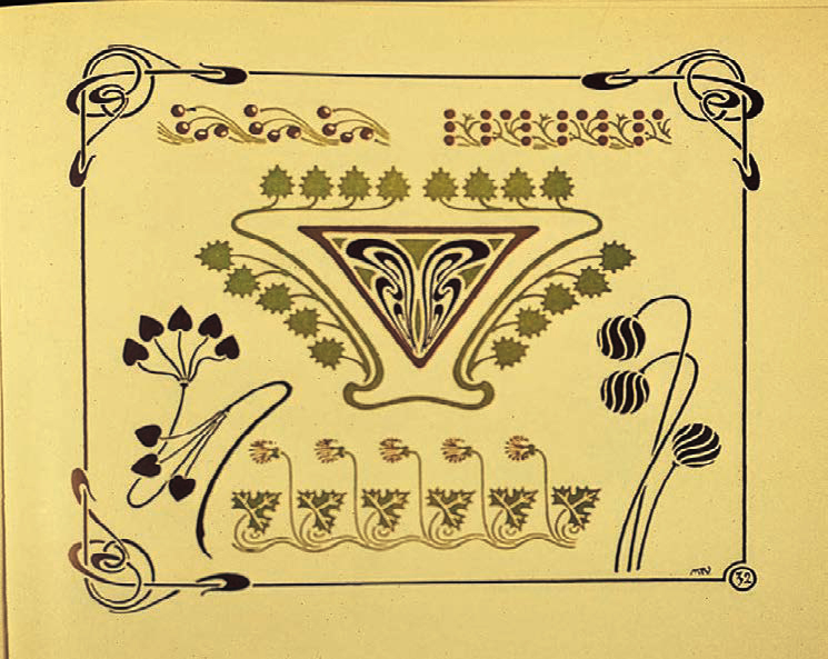
Maurice Verneuil, page from Combinaisons ornementales, 1900. Art nouveau was spread by pattern books for artists and designers.

Emmanuel Orazi, poster for La Maison Moderne (The Modern House), 1905. Furniture, objects, clothing, jewelry, and even the woman’s hair evidence the totality of the movement.

A. L. Rich, trademark for General Electric, c. 1890. This design satisfies the requirements of a successful trademark: it is unique, legible, and unequivocal, which explains why it has survived decades of fluctuating design approaches.

Eugène Grasset, cover for Harper’s Magazine, 1892. Grasset’s work, combining flowing contours and flat color with an almost medieval flavor, captured the American imagination.

Louis Rhead, cover for Harper’s Bazar, 1894. Dazzling linear patterns animate the background. Note the intensity of Rhead’s colorful advertisement for Royal Baking Powder on the back cover, in contrast to the other three more typical ads.

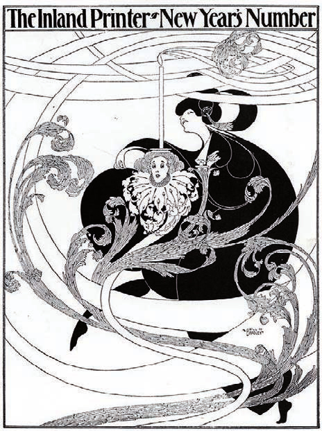
Will Bradley, covers for the Inland Printer, July 1894 and January 1895. Bradley’s graphic vocabulary ranged from delicate contour line for an overall light effect, to complex full-tone drawing, to reduction of the image to black-and-white silhouette masses.

Will Bradley, covers for the Inland Printer, July 1894 and January 1895. Bradley’s graphic vocabulary ranged from delicate contour line for an overall light effect, to complex full-tone drawing, to reduction of the image to black-and-white silhouette masses.

Will Bradley, cover for the Inland Printer, 1895. Figures are reduced to organic symbols in dynamic shape relationships.

Will Bradley, poster and cover for the Chap Book, 1895. Repetition of the figure in a smaller size, overlapping the larger figure, enabled Bradley to create a complex set of visual relationships.

Will Bradley, binding for The Quest of the Golden Girl. The poster promoting this book was designed by Ethel Reed.

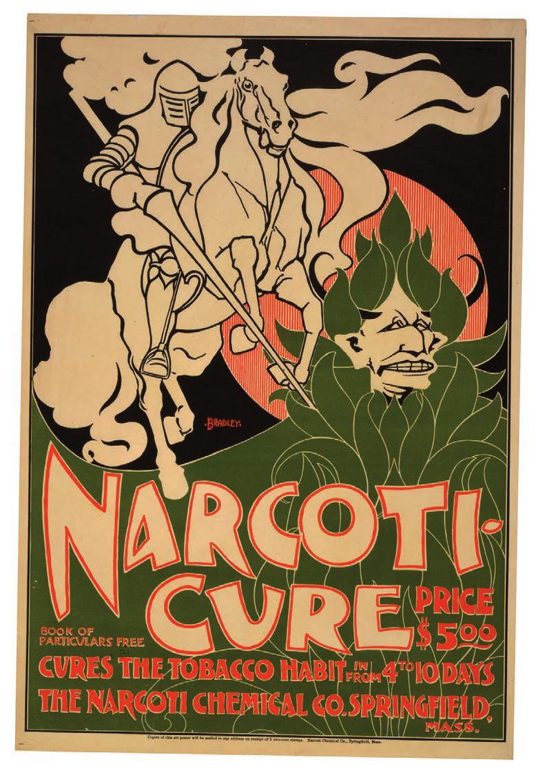
Will Bradley, poster for the Narcoti Chemical Company, Springfield, Massachusetts, 1895.

Will Bradley, poster for Bradley: His Book, 1898. Medieval romanticism, Arts and Crafts inspired patterns, and art nouveau are meshed into a compressed frontal image.

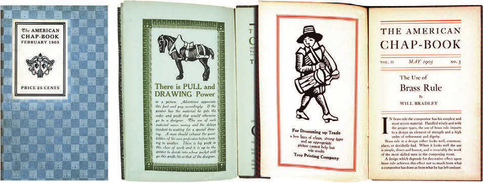
Will Bradley, covers and spreads from The American Chap-Book, 1905. Designers, compositors, and printers drew ideas and possibilities from Bradley’s demonstration designs and ornaments.

Will Bradley, Collier’s cover, March 30, 1907.

Will Bradley, Collier’s cover, March 13, 1909.

Ethel Reed, poster for Arabella and Araminta Stories, by Gertrude Smith, 1895. With an imaginative use of three-color printing, the blond hair of the two girls glows against their black clothing.

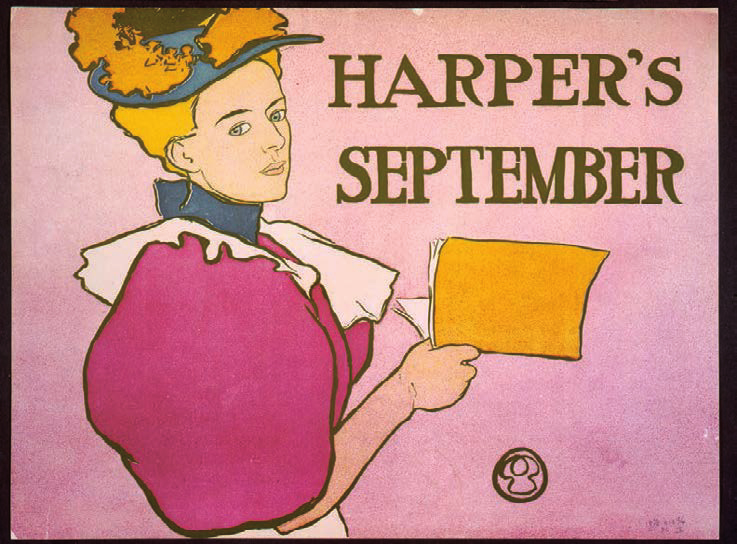
Edward Penfield, poster for Harper’s, 1894. The simplicity of message and image is remarkably similar to the plakatstil design movement.

Edward Penfield, “Poster Calendar,” 1897. Clearly a self-portrait, this shows the artist at work accompanied by one of his beloved cats. His stipple technique is used to create the tone for the background.

Edward Penfield, poster for Harper’s, 1897. Spatial compression similar to a telephoto lens converts five overlapping figures into a rhythmic two-dimensional pattern.

Will Carqueville, poster for Lippincott’s, January 1895. The pensive Lippincott’s reader seems to be reflecting upon a passage from the magazine. The bold flat colors are characteristic of Carqueville’s earlier poster designs.

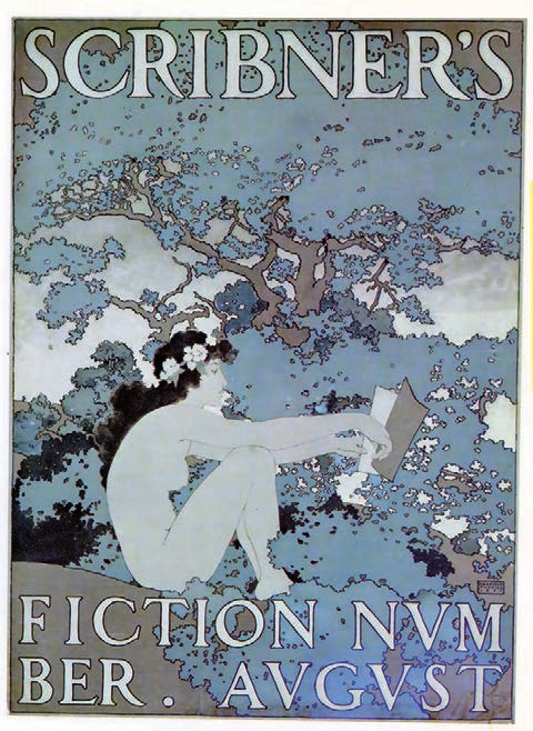
Maxfield Parrish, poster for Scribner’s magazine, 1897.

Georges Lemmen, cover design for a Les Vingt (The Twenty) exhibition catalogue, 1891. A rising sun, symbolic of the group, ascends over a rhythmic sea of swirling lines.

Henri van de Velde, poster for Tropon food concentrate, 1899. This swirling configuration may have been inspired by the separation of egg yolks from egg whites.

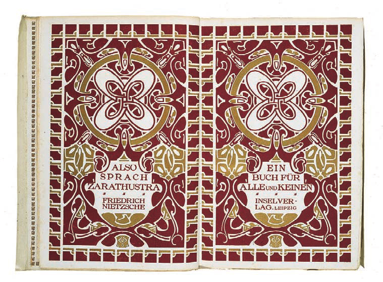
Henri van de Velde, title pages for Also Sprach Zarathustra (Thus Spoke Zarathustra), 1908. In this monumental art nouveau book design, bold graphic shapes fill the pages.

Henri van de Velde, text pages from Also Sprach Zarathustra, 1908. Gold ornaments cap each column of type. The chapter heading design is in the center of the left page, and a chapter section is indicated high on the right page.

Privet Livemont, “Absinthe Robette” poster, 1898. The sensuous female figure is clearly enthralled by the now banned liqueur.

Privet Livemont, poster for Rajah coffee, 1899. The steam from the coffee cup and the product name are entwined in a fascinating interplay of forms.

Gisbert Combaz, poster for La Libre Esthétique, 1898. The sinuous art nouveau line acquires the mechanistic precision of a French curve.

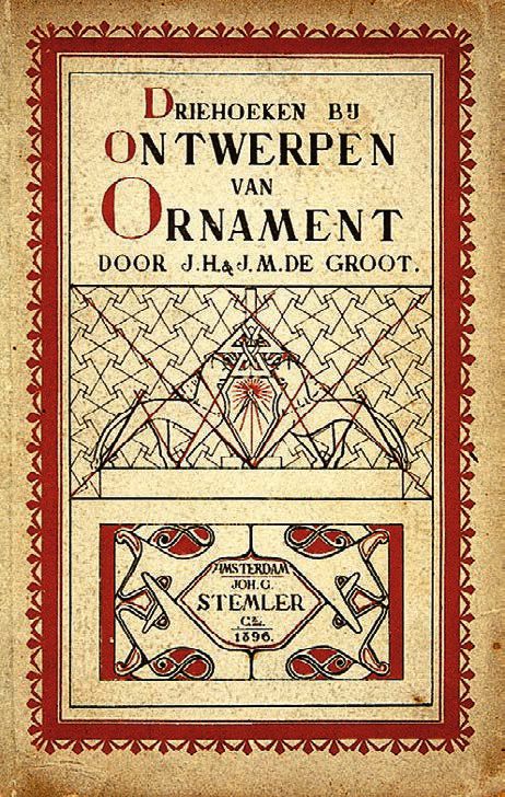
J. H. and J. M. de Groot, Driehoeken bij ontwerpen van ornament (Triangles in the Design of Ornament), published by Joh. G. Stemler & Cz., Amsterdam, 1896. This is one of many Dutch books that provided instruction on the construction of art nouveau ornaments.

Chris Lebeau, binding for De stille kracht (The Quiet Power) by Louis Couperus, published by Van Holkema en Warendorf, Amsterdam, 1900. The binding uses the batik process that was indigenous to the Dutch East Indies (now Indonesia).

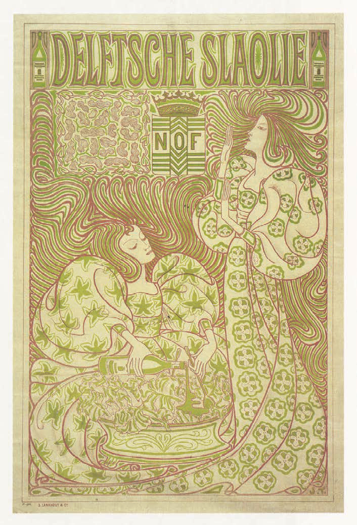
Jan Toorop, poster for Delftsche Slaolie (Delft Salad Oil), 1894. Printed in yellow and lavender, this poster becomes kinetic through its undulating linear rhythms and close-valued complementary colors.

Jan Toorop, binding for Psyche, by Louis Couperus, published by L. J. Veen, Amsterdam, 1898. Psyche is a symbolic, tragic, and erotic fairy tale of Princess Psyche, Prince Eros, and the winged stallion Chimera.

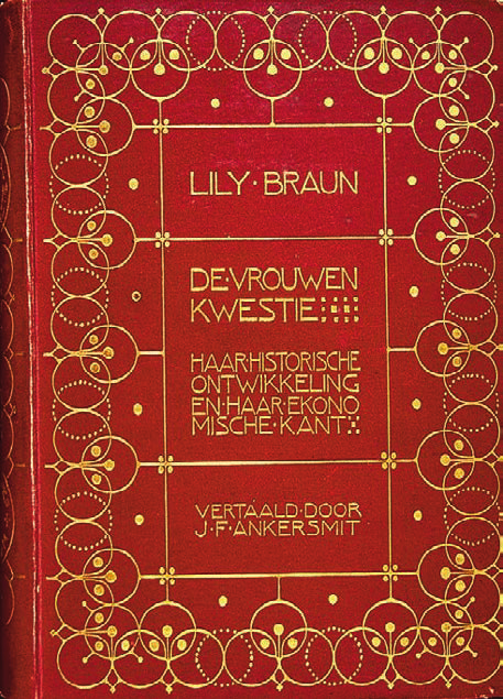
S. H. de Roos, design for De vrouwen kwestie, haar historische ontwikkeling en haar economische kant (The Woman Question, Her Historical Development and Her Economical Side), by Lily Braun, published by A. B. Soep, Amsterdam, 1902.

Otto Eckmann, Jugend cover, 1896. Jugendstil graphics often blended curvilinear stylization with traditional realism.

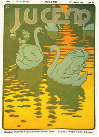
Hans Christiansen, Jugend cover, 1899. The stylized curves of the letterforms echo the curves of the illustration’s flat shapes.

Peter Behrens, page design for Jugend, 1904. Evoking peacock feathers and Egyptian lotus designs, an abstract column rises between two columns of textura-inspired type.

Hans Christiansen, page design for Jugend, 1899. Decorative motifs created lyrical environments for poetry.

Peter Behrens, The Kiss, 1898. This six-color woodcut, controversial for its androgynous imagery, was first reproduced in Pan magazine.

Otto Eckmann, cover for an Allgemeine Elektrizitäts-Gesellschaft catalogue, 1900. Brush-drawn lettering and ornaments express the kinetic energy of electricity.

Otto Eckmann, type specimen for Eckmann Dekorative Schrift, 1901. The blending of contradictory influences—medieval, Asian, and art nouveau—produced an extremely popular type family, Eckmannschrift, which included Decorative Scripts.

Peter Behrens, trademark for Insel-Verlag, 1899. The ship in a circle perched on art nouveau waves typifies Jugendstil trademark design.

Adolfo Hohenstein, Bitter Campari poster, 1901.

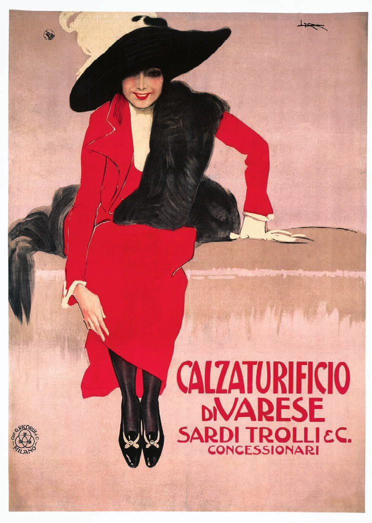
Leopoldo Metlicovitz, Calzaturificio di Varese poster, 1913. This classic Metlicovitz poster exudes an optimistic elegance.

Leopoldo Metlicovitz, poster for the Exposition Internationale Milan inaugurating the Simplon Tunnel, 1906.

Giovanni Mataloni, Brevetto Auer poster, 1895.

Marcello Dudovich, Bitter Campari poster, 1901. The message is unambiguous as Dudovich equates sensual pleasure with that derived from Bitter Campari.

Franz Laskoff, Monte Tabor poster, 1900.

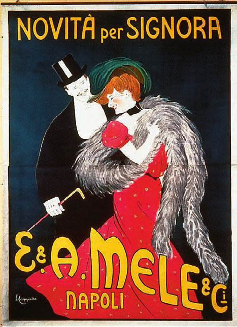
Leonetto Capiello, E. & A. Mele & C. poster, 1903.

Leonetto Capiello, Cinzano poster, 1910. Capiello’s posters consistently display a joyful and exuberant energy.


